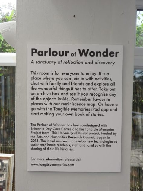
What’s in a name? Do the names we give to projects and collaborative initiatives matter? These may seem like banal or odd questions but they are proving to be important to consider when undertaking a co-designed collaborative project; as we have found out early on in the Parlours of Wonder co-design process.
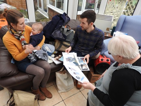
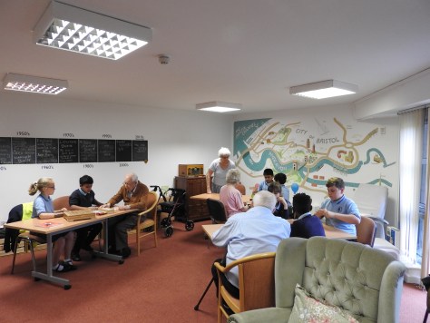
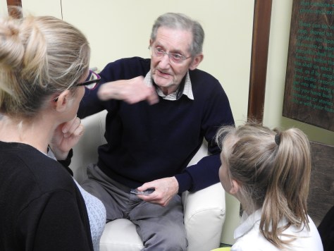
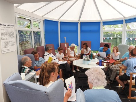
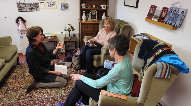
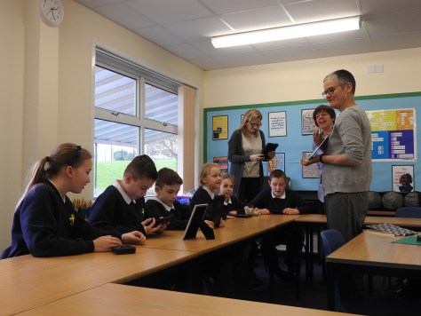
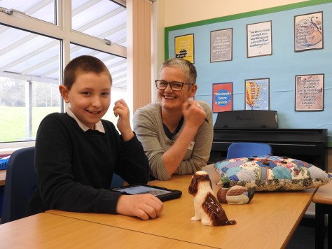
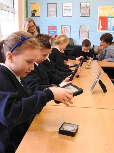
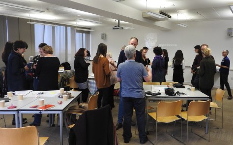
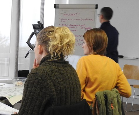
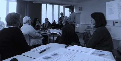
For the last two weeks Bristol University researchers, digital design partners and residents, day centre users and care staff have been coming together for co-design meetings at 3 care settings across Bristol, South Gloucestershire and North Somerset.
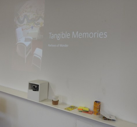
We all met up to discuss the initial designs for a ‘Parlour of Wonder’ that were created from our initial co-design meetings before Christmas. The responses to the initial design ideas created by Stand + Stare clearly demonstrate that the name ‘Parlour of Wonder’ is not insignificant, rather, it is a name that is far from inconsequential.
When Stand + Stare showed assembled care staff, residents and day centre users the initial designs and asked for feedback it was clear that ‘Parlours of Wonder’ conjured something quite specific in each person’s mind and how diverse these expectations were!
As a research team we were interested in ‘re-imagining the parlour for the 21st century’ - taking the idea of a ‘cabinet of curiosity’ or ‘wonder room’ but making the design of this a more inclusive process. However, for our partners, the project title ‘Parlours of Wonder’ conjures up domestic spaces circa the 1940s, for others, an image of cabaret and feather boas, whilst for some it’s a playful space crammed full of colourful stuff. We found no one was associating the project with a “modern” space.
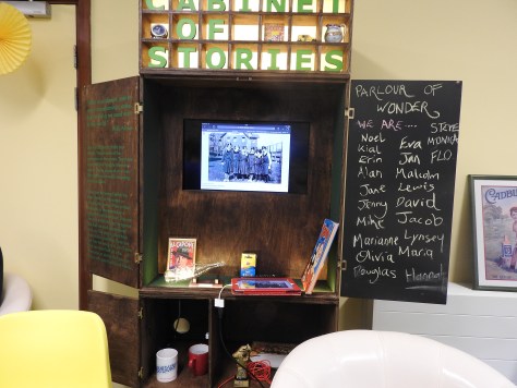
When we introduced our initial ideas one member of the care staff team asked: “This cabinet is a modern style, but presumably you could make it look older?” This question and others like it from other care staff was very revealing about individual expectations that arise from the ‘Parlour of Wonder’ as a project title and concept.
So whilst those managers who are setting aside a room within their care setting and those gathered who use the care settings’ services seem to associate ‘Parlours of Wonder’ with something ‘old’, for ourselves and our design partners, these Parlour of Wonder spaces are not necessarily so, for both practical reasons (to accommodate the storage and use of ipads with the Story Creator app) but also related to ideas of disruptive design, where we see benefit in thinking differently about what care home spaces might look like, feel like and what they might contain within them.
These initial experiences, then, have led us all to wondering whether the name of the project is misleading and has led to expectations the design team feel they cannot fulfil. With this in mind we are all keen to see what evolves from the latest round of co-design meetings with regards to the Parlour of Wonder design itself, but also, were we to change the name of the project, what would be most suitable? …Watch this space!
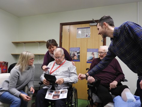
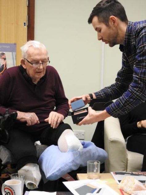
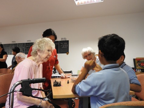
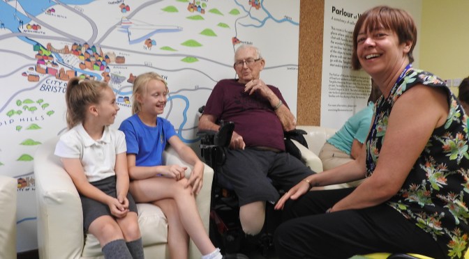
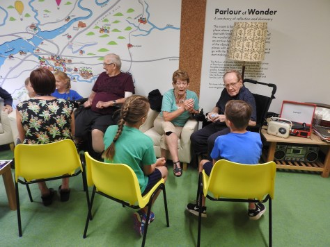
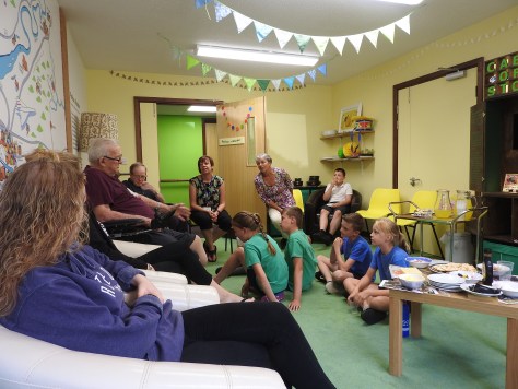
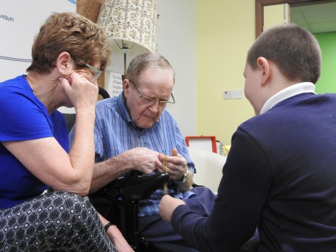
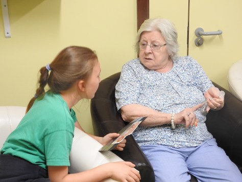
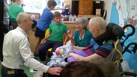
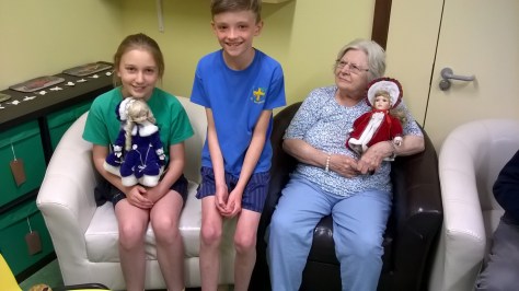
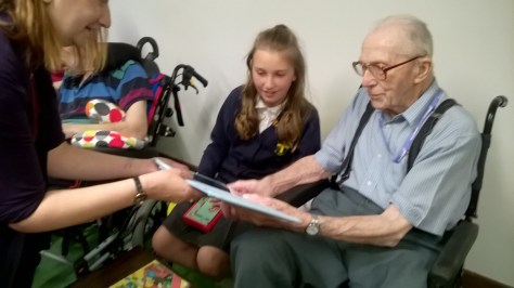
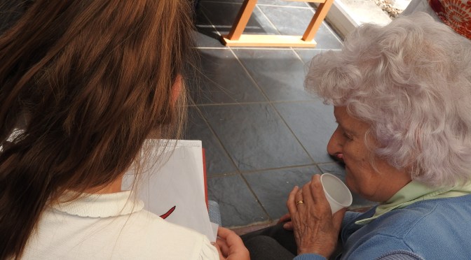
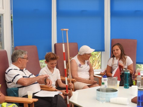
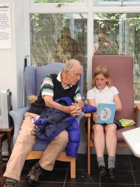
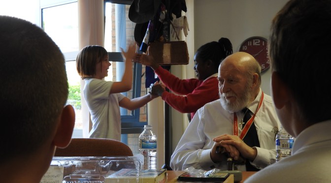
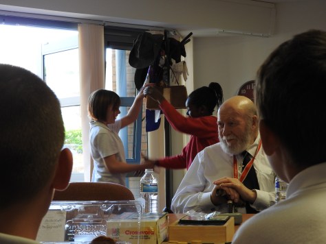
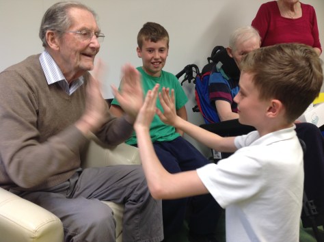
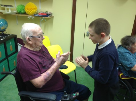
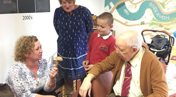
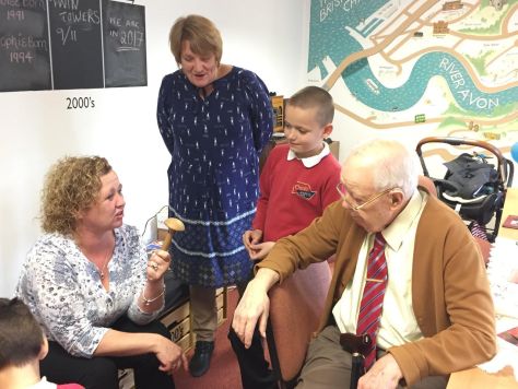
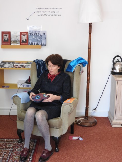
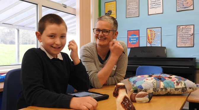
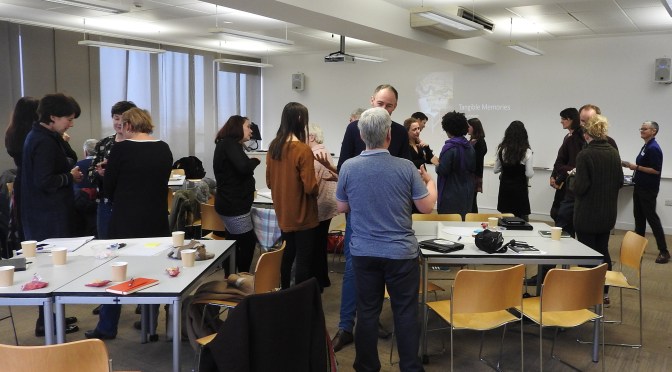
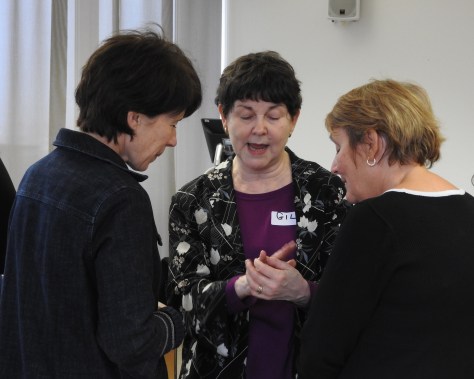
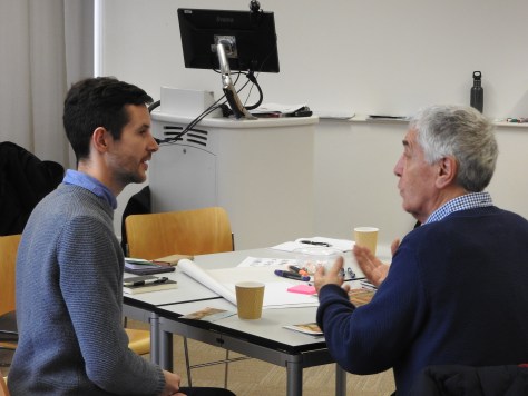
Below are photos from two of our co-design meetings where the designers, Stand + Stare, are sharing their designs with residents and care staff. The colour red was a popular choice chosen from the Valchromat samples supplied by the designers, who are considering this material in order to make the cabinets to go into each Parlour of Wonder.
